
When it comes to paint colors, its important to follow some design rules. With all the colors and fabrics available to choose from there is room for interpretation but too many options can also make it easy for you to make a wrong turn. Using color in your home design can be tricky and there are some common design mistakes that many homeowners will make.
Paint Color Mistakes to Avoid
- Don’t pick the paint color first. This should be the last thing you do. It’s important to plan the room out before you start looking at paint colors. That way you can narrow down the colors that may or may not work simply by going off the fabrics in the room.
- Don’t pick a color that is too bright or saturated. Cheery, happy colors are eye catching, but these colors almost always end up overwhelming a space, especially tiny spaces. If a space is not well-lit and small, bright colors can become intense and visually uncomfortable.
- Don’t match too much. If you choose paint that matches your furniture it can make the room look boring. It also leaves nothing interesting to catch your eye in the design of the room. You should pick a shade that is much lighter or darker to complement the furniture.
- Don’t pick a color just because it’s trendy. While it can be a great start to look at what’s popular at the time, it’s important to keep your personal taste in mind. For example, gray is popular right now but if you find gray depressing, don’t paint your entire home that color!
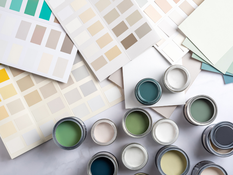
- Don’t rely on tiny paint chips. You can get an idea of what it might look like with a paint chip, it just isn’t enough. It’s very important to test paint directly on the wall. You need to see the color on large swatches in areas of shadow and areas that receive direct light. This is the only way you can get a real sense of what the color will look like.
- Don’t use white to lighten a room. This seems like a good idea that should work but it can have the opposite effect. If there isn’t a lot of natural light, white can look dirty. Instead, choose a color with some hue in spaces without a lot of light.
- Don’t divide an open floor plan. Sometimes an open floor plan can seem too open, but you need to be careful painting two-tone walls in open spaces. It can create awkward divisions in the flow of your home. Instead, paint the whole space one color or add subtle color shifts around the space.
- Don’t be afraid of color. Don’t stick to the more muted sections of the color wheel because you’re scared you may have to repaint if you don’t like it. Paint is an inexpensive way to change the look of a space so have fun with it!
Interior & Exterior Painting & More in Amagansett, Bridgehampton, East Hampton, Hampton Bays, Montauk, North Haven, North Sea, Noyack, Shelter Island, Sag Harbor, Shinnecock Hills, Southampton, Springs, Water Mill, Westhampton & Westhampton Beach, New York
Are you intimidated when it comes to choosing paint colors? Contact L.W. Winslow Painting, Inc. for a color consultation today!